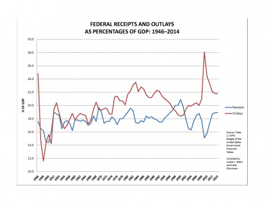
In the discussion of whether the problem with our national public debt is a question of receipts, outlays, or both, I linked to a helpful set of graphs from Anthony Davies, an economics professor at Duquesne University. This data shows that even though a variety of tax rates have changed a great deal over the years, the federal government has basically taken in receipts within the range of 16-20% of GDP over the post-WWII era. If you haven’t looked at this presentation before, you should do so now.
And today, Grove City economics professor and AU faculty lecturer Shawn Ritenour links to another chart, which compares these receipts against historic federal outlays (or spending). He notes (and refutes) Joe Weisenthal’s contention that “any politician who says Washington has a spending problem, rather than a revenue problem, is speaking from a position of anti-tax ideology, rather than empirical data.”
But I think if you look at the history of receipts and outlays a bit closer, you’ll see that the variance in receipts over the last decade are well within the historical norms. But the variance in outlays over that period isn’t outside the norms, either, in the sense that it continues a disturbing trend after 1970. (The data for current and future years is estimated and gleaned from sources here.)

There used to be some correlation between the red and blue lines. But not in today’s Washington.

Again, given this historic perspective, I think it’s hard to blame the blue line for the current debt levels. Keep in mind too that since these figures are a function of GDP, as the economy grows, other things being equal so too does the spending and receipts of the federal government.
In addition to the larger versions of the graphs clickable above, you can download this set of graphs in PDF form here, and visit our “Principles for Budget Reform” page to read more related commentary.

