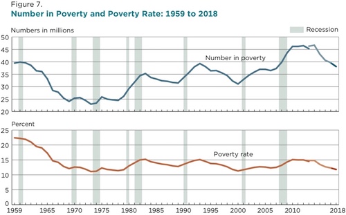
The U.S. Census Bureau released its official poverty rate on Tuesday – and the news on poverty, income, and unemployment is encouraging. Here are four charts that help explain the information.
Chart 1: Poverty declined in 2018 to pre-Great Recession levels
“In 2018, for the first time in 11 years, the official poverty rate was significantly lower than 2007, the year before the most recent recession,” the Census Bureau announced today.

A total of 1.4 million Americans moved out of poverty in 2018. The benefits were shared by all ethnic and socioeconomic groups with one exception: People 25 or older without a high school diploma. (Encouraging people to drop out early is another problematic side effectof raising the minimum wage.)
Charts 2 and 3: The rich get richer. And the middle class get richer. And the poor … get richer
Median household income hovered at $63,179. Although the media portrayed this year’s income data as catastrophic – “The data illustrate why 4 in 10 Americans sometimes face what economists call ‘material hardship,’ struggling to pay for basic needs such as food and housing,” reported CBS – those who earn their money saw a significant benefit.
“Between 2017 and 2018, the real median earnings of all workers increased 3.4 percent to $40,247,” the Census reported.
The St. Louis Federal Reserve’s chart of real median household income in the United States shows an unmistakably upward trend:
“Yes, the middle class is disappearing but it’s because they’re moving up to higher income groups,” wroteAEI scholar Mark J. Perry. More than 30 percent of Americans earned $100,000 a year or more in 2018, up from nine percent in 1967, in constant (2018) dollars. Meanwhile, those earning $35,000 or less fell by one-quarter.
Maybe the most important finding from today’s Census Bureau report on Income. Yes, the middle class is disappearing but it’s because they’re moving up to higher income groups. The share of US households making $100K (2018 $$) has more than tripled since 1967, from 9% to 30.4%. pic.twitter.com/1ZS9IzNmzo
— Mark J. Perry (@Mark_J_Perry) September 10, 2019
Income inequality is misleading, or worse, as a measure of national economic health. However, there were (extremely) modest changes in income inequality. Specifically, it fell.
The bottom 60 percent of income earners saw their share of aggregate income rise modestly, while the top 20 percent (and the top five percent) experienced a mild reduction. And the Gini Index of Income Inequality fell from 0.471 to 0.464.
Chart 4: Employment makes all the difference
If you want to avoid poverty, there’s a nearly foolproof way to do so: Hold a full-time job all year long. Only 2.3 percent of people who worked full-time, year-round lived in poverty in 2018. Similarly, 1.7 percent of Canadians in full-time employment were in poverty. This is yet more vindication of the “success sequence,” developed by Isabel V. Sawhill and Ron Haskins of the Brookings Institution. This is even more impressive, as the OPM overestimates real poverty.
The Bureau of Labor Statistics (BLS) shows the civilian unemployment rate dipping to an historic low, allowing more Americans to lift themselves out of poverty.
Overall, the Census Bureau’s report shows a nation rebounding from the Great Recession, fueled by new confidence, freed to enjoy the benefits of our labor by easing the federal tax and regulatory burden. Americans are escaping poverty, not by enacting a new government program, but simply by getting out of the way and allowing people to use their full, God-given talents.